
Paris College of Art
Paris College of Art
Art Direction, Branding, Graphic Design, Identity, UX, UI
Art Direction, Branding, Graphic Design, Identity, UX, UI
2023
2023
2023
ABSTRACT
DESTINATION
ABSTRACT
DESTINATION
ABSTRACT DESTINATION
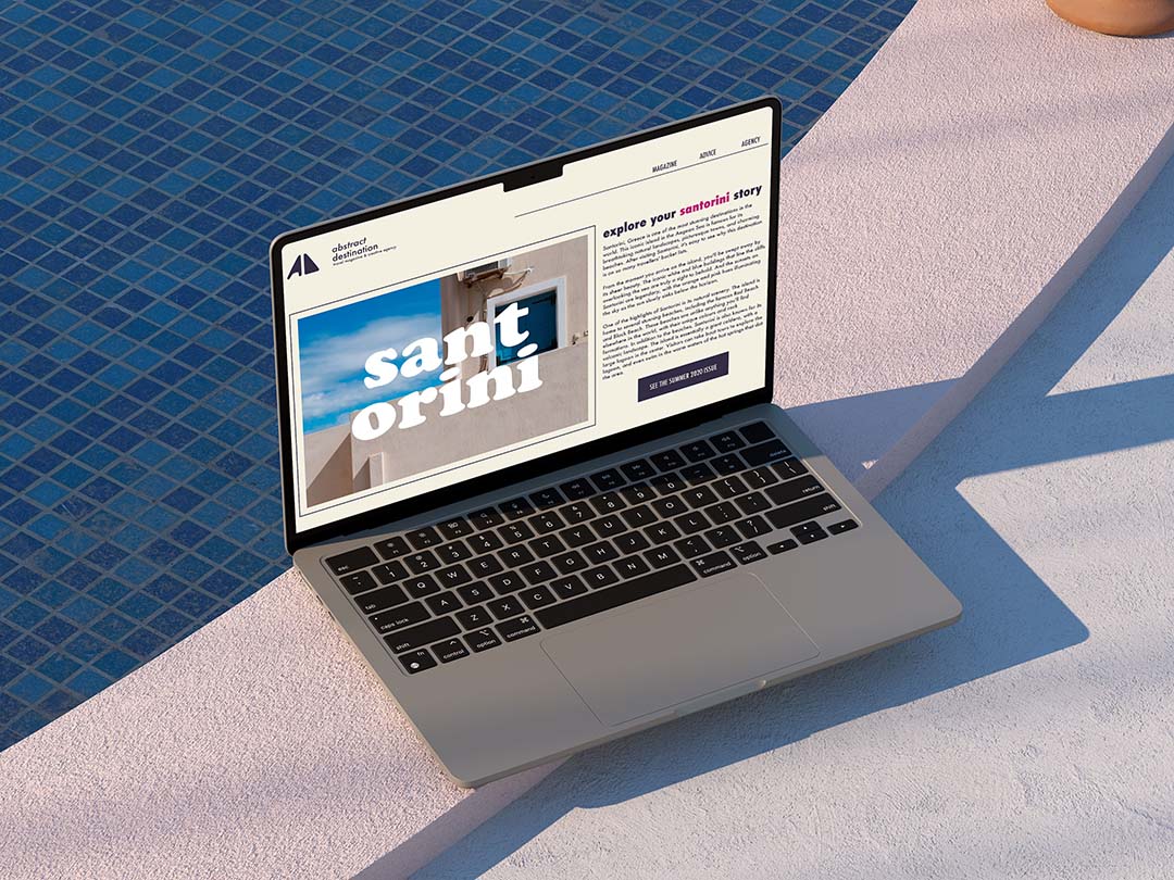
Inspired by the likes of Italy Segreta, Abstract Destination is a fictional branding agency and travel blog I created while attending Paris College of Art. The goal was to develop a comprehensive brand identity using both physical and digital assets — a challenge considering I created the company concept from scratch in this time as well!
This project taught me to love branding and visual identity. I learned about a space that would allow me to bring all of my favourite skills into one focused field. Plus, we got to spend weeks talking about fonts which is personally something I can never get enough of.

SCOPE
SCOPE
SCOPE
I had one semester to create a complete company branding package from scratch. My concept was a design agency packaged as a travel agency, taking heavy inspiration from Italy Segreta and physical travel magazines such as Condé Nast.
Ultimately, I wanted to answer one question: what would a fashion campaign look like if it were composed of interactive images?
This involved looking into:
The inherit interactive qualities of the garments featured
How the finalized images themselves could be made interactive and therefore more compelling
ASSETS
ASSETS
ASSETS
Business cards
Colour palette
Font package
Logo
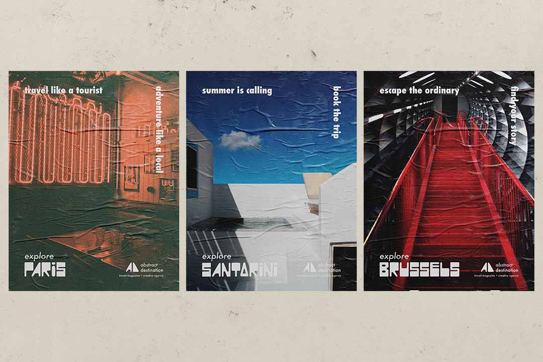
Posters
Website
Business cards
Colour palette
Font package
Logo
Posters
Website

Aimed at younger adult travellers with mid-sized budgets, Abstract Destination needed to be bold and bright to stand out in the saturated market of travel advice.
I chose a tri-colour palette throughout all branding materials to create a bright, summer vibe that screams "time to book a vacation."
Aimed at younger adult travellers with mid-sized budgets, Abstract Destination needed to be bold and bright to stand out in the saturated market of travel advice.
I chose a tri-colour palette throughout all branding materials to create a bright, summer vibe that screams "time to book a vacation."

LOGO PROCESS
LOGO PROCESS
LOGO PROCESS
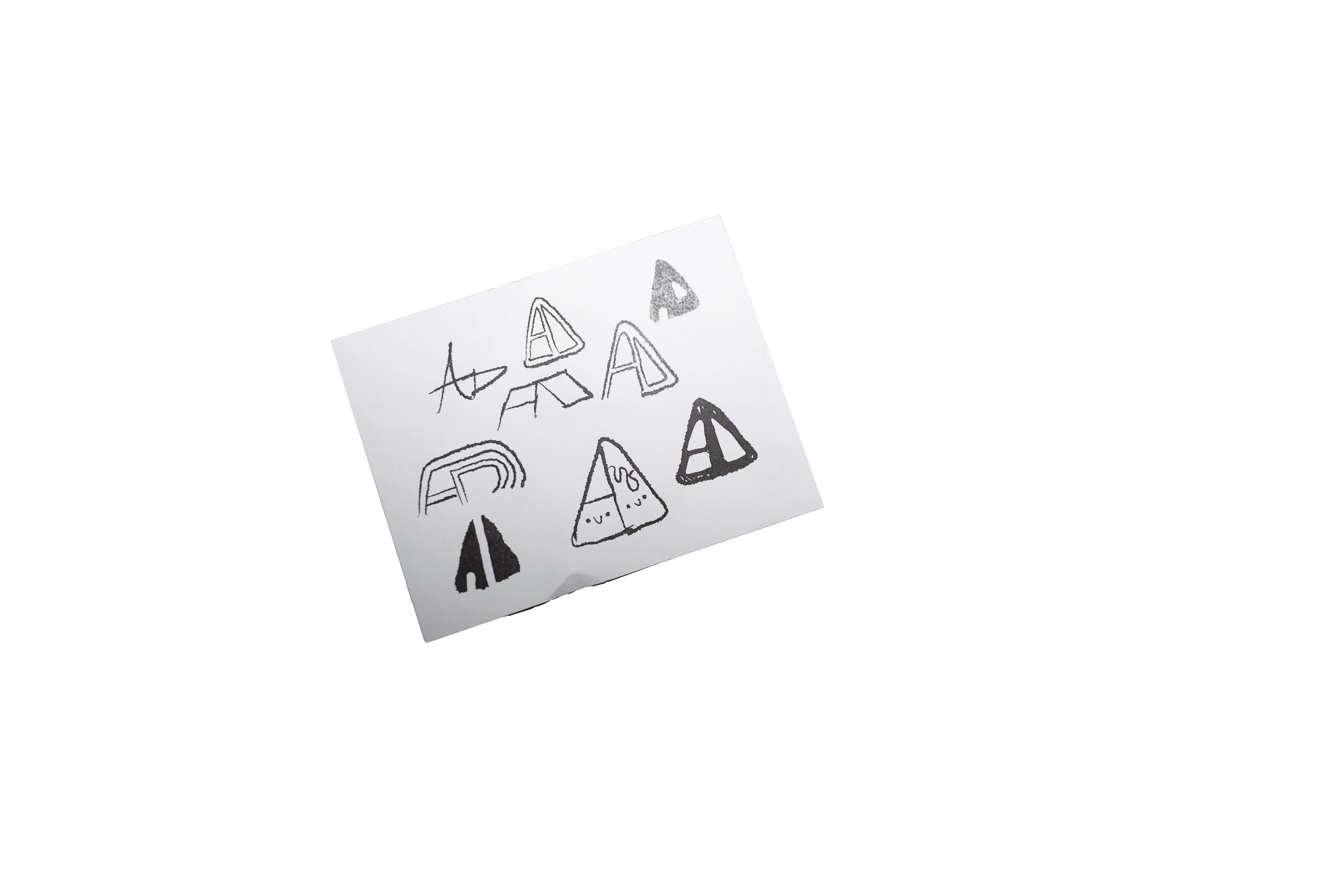
Creating the logo was one of my favourite parts of this project. Through sketching, I landed on a graphic look that played with the triangular shape created between the "A" and "D", something that worked well as both a logoset and a standalone icon.
This lead me to develop an entire alphabet created in this style to be used on additional marketing materials for the company. The typeface was just like Abstract Destination: bold and dramatic yet still playful.


Client
Class
Instructors
Art Direction
Design
Photography
Client
Class
Instructors
Art Direction
Design
Photography
Paris College of Art
Branding & Identity
Marianna Calagna
Gabriele Iacono
Jessica Wynn Cole
Paris College of Art
Branding & Identity
Marianna Calagna
Gabriele Iacono
Jessica Wynn Cole
